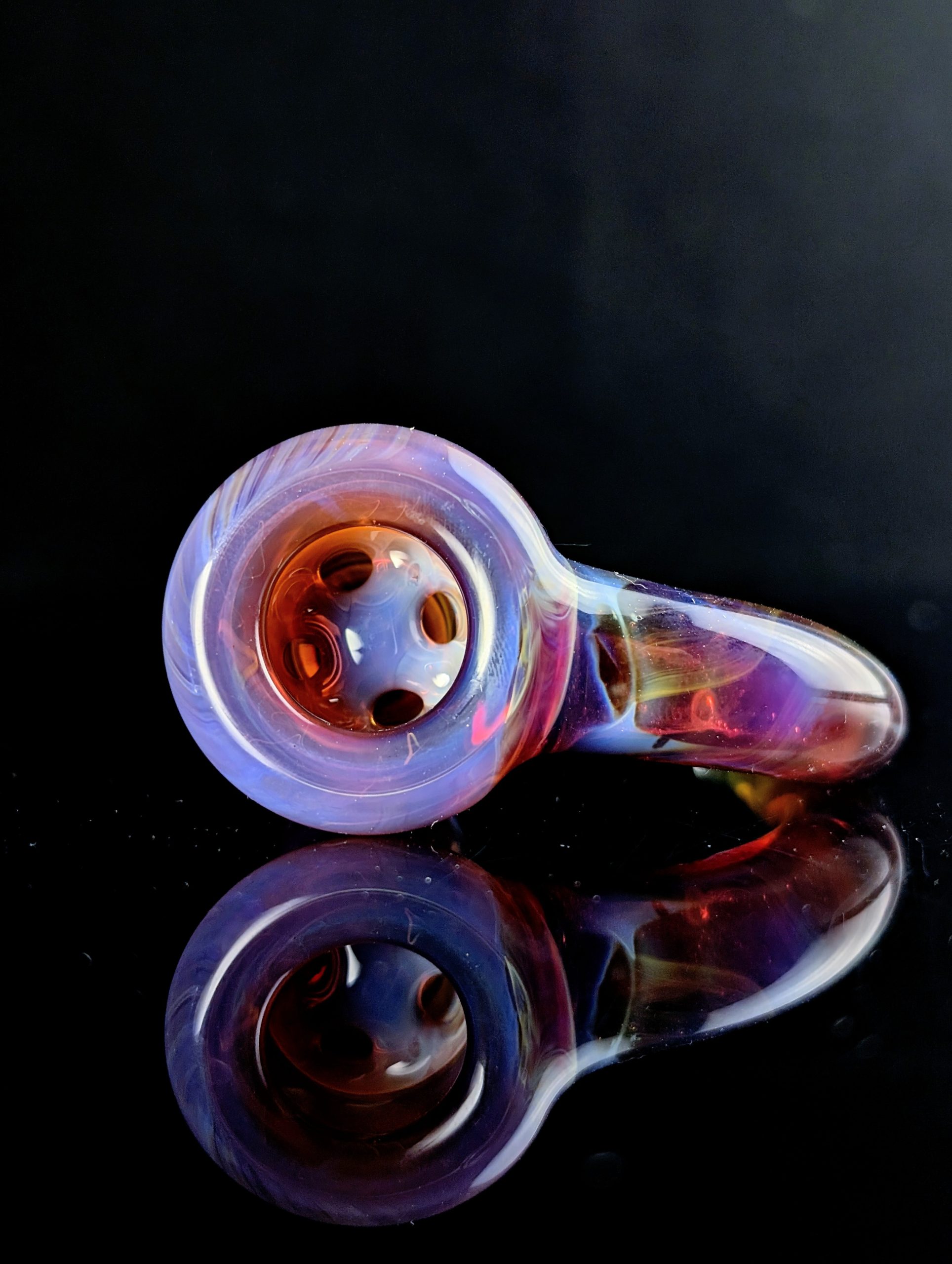
If the previous posts in this series focused on heat history and what happens after the torch, this is the stage where you start deciding what kind of object Amber Purple is actually going to become.
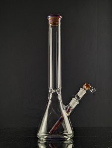
Layering and encasement are not just decorative choices with this color family. They change how light enters the piece, how the strike reads, how much depth the work carries, and how forgiving the final finish will be.
The simplest way to think about it is this:
Use the backing to control brightness. Use the Amber Purple layer to control the strike character. Use the cap to control depth and presentation.
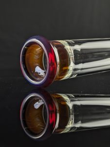
Bright reflective backings, especially Star White, can push Amber Purple toward a stronger, cleaner glow. Warm interlayers such as Yellow or Orange can pull out fire, amber, and red tones. Transparent caps such as clear, Violet, or Lavender can add depth, magnification, and a cooler finished read.
The important rule is that Amber Purple needs to be clean before you bury it. The kiln will develop what you built at the torch. It will not rescue haze, reduction, or contamination trapped under the surface.
When you want gradients, strike through the flame. When you want a more even read through the whole form, kiln striking becomes the better tool.
Working Assumptions
This post assumes standard 33 COE borosilicate practice, experienced bench skills, and no single fixed torch or kiln model.
That matters because a “neutral” or “oxidizing” flame does not look exactly the same on every torch. Kilns also vary in recovery, accuracy, and heat distribution.
For Amber Purple, the safest working baseline is neutral-to-oxidizing. If the goal is a clean purple strike, do not let the flame drift reducing.
This post also assumes that exact piece thickness is not specified. Annealing and striking decisions should always be adjusted for the actual object. Closed forms, thick sections, complex color stacks, and deeply encased metallic colors all deserve extra caution.
Compatible COE is only the first filter. Similar annealing behavior still matters, especially when multiple colors and metallic chemistries are stacked together.
Why Layering and Encasement Matter
Encasing is worth doing when it solves a visual or technical problem. It should not be treated as an automatic upgrade.
A clear or transparent cap can add depth, protect the layer below it, and create new color impressions by acting as an optical filter. In practical studio terms, encasement lets you decide whether Amber Purple will read as:
a surface color,
a buried color,
or part of a more complex optical stack.
Strong borosilicate design often comes down to restraint. The goal is not always more color. Often, the goal is better control over how the color is seen.
Northstar’s own Amber Purple examples point toward a consistent design logic: use a reflective or warm base to shape the light first, then let Amber Purple do the actual striking.
A white backing is especially important. Star White can act like a reflective base that makes Amber Purple appear brighter and more luminous. It also helps suppress the brown transmitted tint that Amber Purple can show when light passes straight through the piece.
That is one of the best reasons to use layering deliberately. Backings do not just make colors brighter. They change which part of the color is allowed to dominate.
Building the Stack
Materials and Compatibility
Stay within 33 COE borosilicate, but do not confuse “same COE” with “same behavior.”
A color may fit the COE range and still behave differently during annealing, striking, or deep encasement. This becomes especially important with metallic and saturated colors.
For Amber Purple stacks, the safest route is to keep the major layers within one manufacturer family unless you have already tested the combination.
If you mix color families, treat saturated or chrome-bearing colors more carefully than the label might suggest. Some pairings may benefit from a thin clear separator. Others may appear fine hot but show checking later.
The practical rule is simple:
Test small before building big.
A good-looking hot connection is not always a stable cold connection.
If you are working with lined tubing instead of applying all layers from rod, preheating becomes part of compatibility practice. Layered tubing already contains uneven thermal mass, so slow kiln preheating can help reduce thermal shock.
Layer Order
The cleanest way to think about an Amber Purple stack is as three separate jobs:
The backing or interlayer
The Amber Purple strike layer
The clear or transparent cap
In most cases:
the backing controls brightness,
the Amber Purple controls the hue shift,
and the cap controls depth.
That structure usually gives more reliable results than trying to make every layer do everything at once.
For a Bright Purple Read
Start with a reflective backing, usually Star White. Apply an even Amber Purple layer over it. Then decide whether the piece needs a clear cap or a cooler transparent cap.
A basic bright-purple stack might look like this:
Layer
Purpose
Star White backing
Reflects light and increases brightness
Amber Purple layer
Provides the strike color
Clear, Violet, or Lavender cap
Adds depth, polish, and optical control
Violet or Lavender can be useful when you want the finished color to read cooler and more intentionally purple. They are especially useful as quiet caps because they do not add the same kind of flame-management problem as another reactive silver color.
For Warmth, Fire, and Honey Tones
If the goal is fire instead of a straight purple read, use a warm interlayer.
Yellow or Orange over Star White can pull Amber Purple toward deeper amber, red, honey, or fiery tones.
A warm stack might look like this:
Layer
Purpose
Star White backing
Reflects and brightens
Yellow or Orange interlayer
Adds warmth and internal fire
Amber Purple layer
Provides the reactive strike
Optional clear cap
Adds depth and protection
This is a strong approach when you want the piece to glow from the inside rather than simply read as purple on the surface.
For Softer or Pastel Contrast
For softer contrast, consider opaque base colors such as Bubblegum or Periwinkle.
These are not usually the first choices for maximum saturation, but they can be excellent when you want a more atmospheric, illustrative, or pastel palette.
A softer stack might look like this:
Layer
Purpose
Bubblegum or Periwinkle backing
Creates a softer color foundation
Amber Purple layer
Adds strike variation
Clear or transparent cap
Adds depth and polish
This approach is useful when the design needs mood, subtlety, or contrast rather than maximum intensity.
Thickness Guidance
Thickness matters, but the most useful guidance is relative rather than numeric.
A heavy backing can work well because its job is to reflect or filter light. The Amber Purple layer itself usually reads best as a controlled, even skin rather than a bulky mass, unless the goal is thick sculptural color.
The cap should be thick enough to unify and lens the layer, but not so heavy that it softens the form or magnifies every flaw beyond what the design can support.
Different members of the Amber Purple family also behave differently. Some are better suited to thicker blown or sculptural work, while others can be stretched further in thinner applications.
So the real question is not only:
How thick should the Amber Purple layer be?
It is also:
Which member of the Amber Purple family is best suited to this job?
If the form is going thin, it may make more sense to choose a darker or more concentrated family member than to force a lighter one to do work it is not optimized for.
A Simple Design Decision Guide
Use this as a starting point when choosing an Amber Purple stack.
If you want the brightest purple read
Use:
Star White backing
even Amber Purple layer
clear, Violet, or Lavender cap
Best for: clean purple, bright optical depth, high contrast.
If you want warmth and fire
Use:
Star White backing
Yellow or Orange interlayer
Amber Purple layer
optional clear cap
Best for: honey tones, amber-red notes, internal glow.
If you want a softer or more pastel effect
Use:
Bubblegum or Periwinkle backing
Amber Purple layer
clear or transparent cap
Best for: softer palettes, atmospheric work, illustrative contrast.
If you want a gradient
Use:
controlled flame striking
short oxidizing reheats
careful observation through the cap
Best for: directional color, transitions, painterly effects.
If you want uniform color
Use:
clean, haze-free Amber Purple
kiln strike after construction
appropriate annealing for the full stack
Best for: even development, consistency, production-style control.
Flame, Kiln, and Heat History
Before the Cap Goes On
The most important technical rule is simple:
Do not bury dirty Amber Purple.
The initial metallic haze needs to be removed before the piece is worked further or encased. If you trap that gray layer under clear or under a transparent tint, you do not get mysterious depth. You get a cleaner view of the mistake.
The surface should be cleaned up in a strong oxidizing flame before the cap goes on. Keep the work moving, heat evenly, and avoid reduction.
The more even the heat penetration before encasement, the cleaner the final result tends to be. Deep, even heat profiles help build internal color. Shallow or inconsistent reheats tend to leave haze, veil, or surface-biased effects.
Encased silver colors punish impatience more harshly than exposed ones.
What Changes Once Amber Purple Is Encased
Once Amber Purple is buried, the flame and kiln stop behaving like interchangeable tools.
Flame striking through a cap is local, fast, and expressive. It is useful when you want gradients, transitions, or selective development.
Kiln striking is slower and more even. It is usually the better choice when the goal is uniform color throughout the work.
The cap gives you optical depth, but it also changes heat response. It can make localized reheat possible, while also making even flame penetration harder to achieve.
A Practical Strike Sequence for Encased Amber Purple
A reliable working sequence looks like this:
Build and smooth the backing first.
Heat opaque backings slowly enough to avoid pits, bubbles, or boiling.
Apply the Amber Purple layer evenly.
Burn off the initial haze before encasing.
Add the clear, Violet, or Lavender cap only after the surface is clean.
For gradients, use short oxidizing reheats through the cap.
For uniform color, move the piece to the kiln while the buried Amber Purple is clean and not fully overworked.
The goal is to give the kiln clean material to develop, not contaminated material to fix.
Kiln Schedule for Encased Amber Purple
The schedule below is a practical starting point for encased Amber Purple work in 33 COE borosilicate.
It is not a universal program. Closed forms, thicker work, metallic color stacks, and kilns with uneven recovery may need longer soak times, slower drops, or both.
Stage
Temperature
Hold
Purpose
Optional kiln strike
1125–1150°F
About 60 minutes
Develop a more uniform strike in clean, haze-free Amber Purple
Anneal soak
1050°F
1 hour per 0.25 inches of thickness
Relieve working stress in standard 33 COE borosilicate
First controlled drop
925°F
50% of anneal time for pieces 0.25 inches or less; 100% for pieces over 0.25 inches
Slow equalization below the strain point
Second drop
850°F
25% of anneal time
Continue controlled cooling
Third drop
700°F
25% of anneal time
Stabilize thicker or more complex forms
Fourth drop
500°F
25% of anneal time
Controlled exit before room-temperature cooling
Metallic color stacks may sometimes benefit from slightly higher annealing temperatures or longer soaks. The more complex the stack, the less you should treat it like plain clear.
Common Failure Modes
Gray or Muddy Color Under the Cap
This is usually a trapped-haze problem, a reduction problem, or both.
If the gray layer is already buried, reheating may move the color around, but it usually will not become the vivid clean strike you wanted.
Prevention matters more than rescue.
Fix the surface before the cap goes on.
Weak Purple and Too Much Amber
If the finished color feels too warm, the problem is usually stack logic rather than one single bad moment.
Possible causes include:
the backing is too warm,
the Amber Purple layer is too thick,
the work was not developed evenly after encasement,
or the cap/interlayer is pushing the color away from purple.
Yellow and Orange deliberately push Amber Purple toward warmer amber-red reads. Violet, Lavender, and Star White are usually better choices when the goal is a stronger purple impression.
Checks, Cracks, or Late Failures
When a piece looks fine hot and checks later, think beyond COE.
Late failure can come from:
mixed color families,
incompatible annealing behavior,
saturated or reactive colors,
overly aggressive cooling,
closed forms,
or thick encasement.
Test new combinations. Extend soaks when the stack is complex. Avoid aggressive temperature drops through thick or closed encased work.
Boil, Pits, or Rough Backings
This usually starts before Amber Purple ever enters the picture.
Opaque backings such as Star White and Bubblegum need slow, controlled heating. If the backing is rough, pitted, or boiled, the Amber Purple layer over it rarely reads clean.
A clear cap will not hide that problem. It will magnify it.
Distorted Pattern After Encasing
If the cap blurs, stretches, or distorts the design too much, the issue is often mechanical rather than chromatic.
Tube encasement can be a better option when the pattern matters as much as the color. It allows you to preserve the design while still adding a lens.
When the drawing is important, protect the pattern before chasing optical depth.
Design, Finishing, and Cleaning
Transparency, Depth, and Contrast
Clear is the most honest cap. It gives maximum depth, maximum magnification, and the least added color bias.
Violet or Lavender can be better when you want the finished color to read cooler and more intentionally purple.
Star White is the strongest move when you want reflective brightness.
Yellow or Orange is the move when you want internal fire.
Each layer should have a job.
One of the easiest advanced design mistakes is trying to get too many effects from one piece. Clear can lens. Violet can cool. Star White can brighten. Yellow can warm. Amber Purple is already reactive and complex.
If all of those moves are pushed equally, the work can become visually busy and technically fragile at the same time.
The strongest encased Amber Purple pieces usually pick one primary job for each layer and let the rest of the stack stay quiet.
Finishing Decisions
Finishing encased Amber Purple is partly about surface quality and partly about avoiding an accidental second strike cycle.
Clear caps magnify everything:
seams,
chill marks,
ripples,
scuffed polish lines,
bubbles,
and uneven layers.
Do as much shaping and cleanup as possible before the final strike move.
Treat any last flame polish as a color event, not just a cosmetic afterthought.
Cleaning and Presentation
Do not judge Amber Purple under only one studio light.
Check the finished piece in reflected light and, when possible, transmitted light. A white backing can suppress the brown transmitted tint that Amber Purple may otherwise show, which means the same piece can read very differently depending on how it is lit.
That is not automatically a flaw. It is part of the optical design.
Final cleaning matters for the same reason. A clear cap will show fingerprints, residue, polishing haze, and surface contamination more readily than an uncased surface.
Clean the piece before deciding whether the finish is complete.
Final Takeaway
Layering and encasement are where Amber Purple stops being just a reactive color and starts becoming a design system.
Once you understand what the backing is doing, what the strike layer is doing, and what the cap is doing, the choices get simpler.
You stop asking whether the piece needs more color and start asking a better question:
Does it need more reflection, more depth, more warmth, or less noise?
That is when Amber Purple becomes easier to direct and much harder to waste.
Amber Purple: Cooling, Annealing, and What Happens After the Torch
The Work Doesn’t End When the Torch Turns Off
The work does not end when the torch turns off. With Amber Purple, the color you finish with at the bench is only part of the story. This is a striking glass, and that means the final result depends on heat history, flame atmosphere, surface condition, and what happens in the kiln afterward. Cooling and annealing are not just there to keep the piece from cracking. They are part of how the color settles, deepens, or gets lost.
Cooling Holds the Colour You Built
It helps to separate two different jobs that often get blended together. One job is color development. The other is structural annealing. Northstar’s general borosilicate chart puts the standard annealing temperature at 1050°F and the strain point at 960°F, with anneal time scaling by thickness. That means a proper post-torch cycle is not just one hold and done. The piece still needs time to stabilize after any strike work is finished. In thicker or more complex work, the first soak below anneal matters even more because that is where the structure starts to come into balance before the rest of the cool-down continues.
Surface Condition Before the Kiln
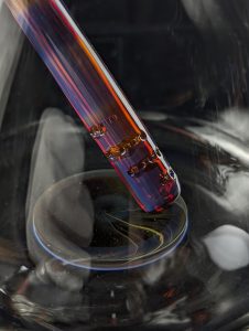
Before Amber Purple ever goes into the kiln for color development, the surface has to be clean. Northstar is very clear about this. The initial haze is reduced silver metal that leaves the body of the glass and deposits on the surface. If that layer is left in place, it thickens, turns matte gray, and masks the real color underneath. Their published procedure is to turn the work slowly in a strong sharp oxidizing flame and heat the surface aggressively enough that it almost boils, because that initial clean-up is the step everything else depends on. The kiln will not rescue a dirty surface. It will only develop what you gave it.
Flame Striking and Kiln Striking Are Not the Same Thing
Once the haze is removed, there are two different ways to push the color. If you want a gradient or a more selective look, Northstar’s flame-strike method is simple and very controlled: let the piece cool for about twenty seconds, wait until the glow is gone, then bring it back in a soft neutral flame so the surface barely glows. If you want it darker, repeat in short increments. That approach lines up with a broader striking pattern seen on the Glass Alchemy side too: reset the color hot, let it rest, then reintroduce heat in very small doses because short exposures can make large visible differences. Flame striking is best when you want control over where the color develops. Kiln striking is better when you want the color to develop more evenly through the piece.
The Kiln Range That Actually Matters
For Amber Purple itself, Northstar’s published kiln-strike window is more specific than the ranges people often repeat from shop talk. Their family page says to place haze-free, unstruck Amber Purple in the kiln and hold it at 1125°F to 1150°F for about sixty minutes, or until the desired intensity is reached. That hold is for color development, not for the final structural anneal. After that stage, the work still belongs on a proper borosilicate anneal path near 1050°F. Other makers’ amber-to-purple and silver-striking pages do reinforce the idea that extra kiln time around 1100°F can deepen certain colors, but those are adjacent formulations and should be treated as supporting evidence, not replacements for Northstar’s direct Amber Purple schedule.
Thin Work Needs More Restraint
This is the point where patience matters. Northstar explicitly warns that thinner work may slump at the published Amber Purple strike temperatures. Their older BoroNews issue also warns that even the initial haze-removal phase has to be done quickly enough to avoid boiling and slumping. In practice, that means the hotter kiln-strike window is powerful, but it is not something to apply casually across every form. Thin blown work, delicate details, and pieces that are already close to moving should be approached more carefully than heavier sculpture or thicker sections.
Common Problems After the Torch
Most problems in this stage trace back to one of four things. The first is poor oxidation when the goal was purple. Northstar’s current pages consistently point toward oxidizing or at least neutral-to-slightly oxidizing conditions for the strongest purples, while warning that reduction pushes the color toward milky amber, opacity, or other off-path results. The second is leftover haze. If the silver stays on the surface, the color goes gray and loses life. The third is confusing strike temperature with anneal temperature and skipping the structural soak after the color hold. The fourth is assuming the hot look is the final look. Across the other two source sets, the same pattern shows up again and again: some silver-striking colors look clearer while working, some need to be fully worked before purple will show, and some darken only after deliberate kiln time.
Carrying Control Through the Whole Cycle
The real lesson here is that Amber Purple rewards continuity of control. You do not finish the color at the torch and then hand the rest of the job over to the kiln. You carry the same discipline all the way through: clean the surface completely, decide whether you want a flame gradient or a kiln-developed field of color, separate the strike hold from the structural anneal, and watch the form while the color is being pushed. That is how stronger saturation, cleaner purples, and more consistent results actually happen.
What Comes Next
Once the post-torch phase is understood, the next step is using that control on purpose. The next post can move into layering, encasement, and design choices, because that is where the color is not just preserved but directed. By that point, the question is no longer whether Amber Purple will strike. It is how intentionally you want it to do it.
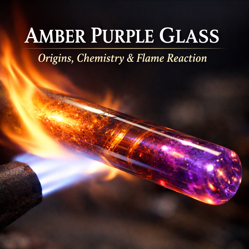
Amber Purple glass is one of the most influential colors ever introduced to borosilicate lampworking. Known for its reactive behavior and dramatic color shifts, Amber Purple fundamentally changed how artists think about heat, flame chemistry, and color development.
This article explores the origins of Amber Purple glass, the chemistry behind its reactions, and why it remains a foundational material in glass studios today.
What Is Amber Purple Borosilicate Glass?
Amber Purple is a silver-bearing borosilicate glass color designed to respond dynamically to heat and flame atmosphere. Unlike stable colors that appear finished directly out of the flame, Amber Purple develops its final appearance only after controlled heat cycling.
Depending on technique, Amber Purple glass can produce:
Amber and gold tones
Purple, violet and blue hues
Smoky neutral shades
This variability makes it both versatile and technically demanding.
The Origins of Amber Purple Glass
When Amber Purple was first introduced, it represented a major shift in how borosilicate color behaved. At the time, most colors were predictable and stable once formed.
Long before Amber Purple became a staple borosilicate color, early flame workers were already observing how silver behaved inside glass. Experiments conducted within university glass programs revealed that silver-bearing glass could change color when reheated or exposed to light. These early discoveries laid the groundwork for understanding striking behavior, a defining characteristic of Amber Purple today.
Amber Purple demonstrated that color could be manipulated after shaping. Heat history and flame conditions directly influenced the final result. This discovery opened the door to an entirely new category of reactive borosilicate glass colors.
Amber Purple Glass Chemistry Explained
The distinctive behavior of Amber Purple glass comes from its silver-based chemistry. Silver compounds are dispersed within the glass matrix and respond to changes in temperature and flame atmosphere.
Several factors influence color development:
Flame temperature
Oxidizing versus reducing conditions
Heat cycling and cooling intervals
Rather than sitting on the surface, color develops internally within the glass structure. This internal development gives Amber Purple depth and complexity that stable colors cannot replicate.
Why Amber Purple Is Considered a Teaching Color
Amber Purple is often described as a teaching color within the borosilicate community. Artists who learn to control it typically develop stronger fundamentals in:
Flame chemistry awareness
Heat distribution
Timing and restraint
Because Amber Purple responds visibly to small changes in technique, it quickly reveals inconsistencies in flame control. This makes it a valuable learning material for both new and experienced lampworkers.
Common Challenges When Working With Amber Purple Glass
Early use of Amber Purple often produces inconsistent results. Most issues can be traced back to heat management or flame chemistry.
Common challenges include:
Overheating, which can erase developed color
Insufficient heat cycling, leading to weak color strikes
Failure to burn off initial haze
Understanding these behaviors allows artists to achieve more repeatable and intentional results.
Why Amber Purple Glass Remains Popular Today
Despite the availability of many modern reactive colors, Amber Purple continues to be widely used. Its longevity comes from the way it rewards precision and patience while offering expressive range.
Many contemporary silver-based borosilicate colors are built on principles first demonstrated by Amber Purple. Its influence continues to shape how reactive glass is developed and used.
What Comes Next
In the next article, we will focus on how to work Amber Purple glass in the flame. Topics will include oxidation versus reduction, heat cycling strategies, and techniques for achieving consistent color development.
This article was informed by historical technical literature and educational materials published by Northstar Glassworks, a leading manufacturer of borosilicate glass color. Their early newsletters and technical documentation played a significant role in shaping modern understanding of reactive and silver-bearing glass.
Addition historical context informed by writings published in The Flow® magazine, including work by Freddy Faeron on the early development of borosilicate color and fuming techniques. https://www.glassartmagazine.com/
Lorem Ipsum has been the industry’s standard dummy text ever since the 1500s.